15 Waitlist Landing Page Examples That Actually Convert (2026)
TL;DR: The highest-converting waitlist landing pages share five patterns — a specific outcome-driven headline, a single above-the-fold CTA, tangible social proof, a referral incentive visible on the confirmation page, and zero navigation distractions. The 15 examples below break down how each element works, with templates you can copy.
A great waitlist landing page turns cold traffic into committed leads before your product exists. The best of them convert far better than typical product pages — the exact conversion rate depends on your audience, traffic quality, and offer. What separates a page that captures emails from one that converts visitors into advocates is a small set of repeatable design decisions.
Below are 15 real examples, grouped by what they do best.
What makes a waitlist landing page convert?
Based on public case studies and pre-launch best-practice guides, the highest-performing pages share these five traits:
- Specific, outcome-driven headline. "The inbox that writes replies for you" beats "The future of email."
- One thing to do above the fold. Email input + button. No navigation, no "Learn More."
- Visible social proof. A real signup counter if you have one, press logos, or testimonials from early users. Don't invent numbers.
- Referral incentive on the success page. Skip the queue by inviting friends — this is where viral growth happens.
- Friction-free mobile experience. A large share of pre-launch traffic comes from Twitter/X, Reddit, and Indie Hackers — all mobile-first.
Every example below nails at least three of these. Let's look at what they do.
1. Robinhood — The OG Referral Waitlist
What they did right: When Robinhood launched their waitlist in 2013, they grew to ~1 million signups before launch. The page had one input field, one promise ("Commission-free trading"), and a post-signup screen that showed your exact position in line and a share link that moved you up the queue.
Template to steal:
- Headline:
[Benefit] for [Audience](e.g. "Commission-free trading for everyone") - CTA:
Get early access - Post-signup:
You're #18,472 in line. Move up by inviting friends.
The genius is the position counter — it created sunk-cost psychology. Once someone saw their number, they were emotionally committed to climbing.
2. Superhuman — Gatekeeping as Social Proof
What they did right: Superhuman's waitlist required a Zoom interview to get in. Instead of killing conversions, it boosted them. The scarcity signal was so strong that being on the waitlist became a badge.
Template to steal:
- Headline:
The fastest email experience ever made - Below headline:
Currently serving 200,000+ professionals. Join the waitlist. - Post-signup message:
We'll be in touch for your onboarding call within 2 weeks.
When to use this: If your product has hand-held onboarding or a premium positioning, manufactured scarcity works. If you're selling a $5/mo tool, it'll feel fake.
3. Arc Browser — Video-First Hero
What they did right: Arc's waitlist page opened with a silent autoplay video showing the product in action. No explainer copy, no feature lists — just 20 seconds of visual demo. Then one question: "Want it?"
Template to steal:
- Hero = 20-second muted loop of your product
- Subhead: one sentence on the audience
- CTA:
Get on the list
Why it works: For visual-heavy products (design tools, mobile apps, hardware), 20 seconds of video converts better than any copy. Video communicates product quality instantly.
4. Notion — Email-Only Simplicity
What they did right: When Notion launched their pre-1.0 waitlist, the entire page was a logo, a one-sentence pitch, and an email field. That was it. They converted 50%+ of visitors from ProductHunt.
Template to steal:
[Logo]

Notion is an all-in-one workspace for your notes,
tasks, wikis, and databases.

[ email@example.com    ] [ Get early access ]
When to use this: You have strong distribution (press, ProductHunt, Twitter audience) and don't need the page to sell. Minimal pages convert best when traffic is warm.
5. Morning Brew — Content-as-Waitlist
What they did right: Morning Brew's early waitlist wasn't pitched as "join the waitlist" — it was "get our daily newsletter, first 100 get lifetime access." The content itself was the reward.
Template to steal:
- Headline:
Get [specific content]. Plus, join [N] founders on the waitlist. - Sub: Sample of what subscribers will receive
- CTA:
Subscribe now
6. Dropbox — Referral Leaderboard
What they did right: The famous Dropbox referral waitlist: invite friends, get extra storage. They grew from 100K to 4M users in 15 months with a 60% referral rate.
Template to steal:
- Clear baseline reward (2GB free)
- Visible leaderboard on success page (
You: 3 referrals | Top referrer: 27) - Incremental unlocks (500MB per friend, up to 16GB)
Adapt for pre-launch: Swap "storage" for "priority access," "features," or "discount."
7. Beehiiv — Press Quote Stack
What they did right: Beehiiv's landing page stacked 4 press logos (TechCrunch, The Verge, etc.) directly under the headline. Newsletter creators trust other newsletter creators, so the social proof signal was immediate.
Template to steal:
- Hero:
As featured in:+ 4 logos (even local publications work) - Signup form under the logos
- Three-sentence founder story below
8. Linear — "For People Who Ship"
What they did right: Linear's headline — "Linear is a better way to build products" — plus a tight, opinionated sub-head that pre-filtered their audience. They wanted serious product teams, not everyone.
Template to steal:
- Headline:
[Product] is a better way to [action] - Sub:
Designed for [specific audience]. Built by [credential]. - CTA:
Request access
Why it works: Opinionated pages convert the right people at a higher rate. You don't need everyone on your waitlist — you need the right everyone.
9. Cron (now Notion Calendar) — Keyboard Shortcuts in the Hero
What they did right: Cron's waitlist page animated keyboard shortcuts in the hero ("⌘+K to open command palette"). For power users, this was an instant "yes, this is for me" signal.
Template to steal:
- Show the power-user behavior in the hero
- Below hero: "Join 12,000+ operators on the waitlist"
- Single email field
10. On Deck — Cohort Countdown
What they did right: On Deck's waitlist page always showed a countdown to the next cohort start date. That single element turned a passive waitlist into a live event.
Template to steal:
- Hero countdown:
Next cohort starts in 23 days, 14 hours - Below: Application form
- Post-application:
We'll review within 5 business days
11. ClickUp — Free-Tier-as-Waitlist
What they did right: ClickUp didn't run a traditional waitlist — they ran a "get free forever" sign-up that functioned as one. Early users got grandfathered pricing.
Template to steal:
- Headline:
Start free. Free forever if you join before [date]. - CTA:
Claim your free account - Sub:
No credit card required
Best for: SaaS products that will eventually charge. Early-adopter grandfathering is incredibly powerful.
12. Framer — Interactive Preview
What they did right: Framer's pre-launch page was itself built in Framer. Visitors could hover, scroll, and interact with the very product they were signing up for.
Template to steal:
- If you're building a design/interactive tool, the page is the demo
- Put the signup form inside an interactive element
13. Tally — Form-as-Waitlist
What they did right: The Tally signup "form" was a Tally form — embedded on the page, demonstrating the product while capturing emails.
Template to steal:
- Use your product to capture signups (dogfooding)
- Works for: form builders, email tools, survey tools, feedback tools
14. Cal.com — "Book the Founder"
What they did right: Cal.com's early waitlist had a Book a call with the founder button next to the email form. Half the people used the Cal.com product to join the Cal.com waitlist.
Template to steal:
- Offer a founder call as the premium path
- Regular signup as the default
- Use your own product for the call booking (if applicable)
15. Raycast — Extension Showcase
What they did right: Raycast's waitlist page scrolled through 30 extensions in 10 seconds. Visitors saw the ecosystem before the product.
Template to steal:
- Show the depth of your product in motion
- Ecosystem > features (for developer tools)
Copy-paste waitlist landing page template
Based on the patterns above, here's a template that consistently converts 30%+ on new accounts:
[Logo]

# [Specific benefit for specific audience]
## [One-sentence elaboration — who it's for and what's unique]

[ email@example.com           ] [ Get early access → ]

 [real signup count — only show if accurate]

As featured in: [Logo 1] [Logo 2] [Logo 3]

---

# How it works

1. Sign up in 10 seconds
2. Share your link — move up the queue for every friend who joins
3. Get first access when we launch (Q3 2026)

---

# What people are saying

"[Quote]"
— [Name, Title]

"[Quote]"
— [Name, Title]

---

# Built by [Founder credential]

[2-3 sentence founder story]

---

[ Get early access ]
What to measure on your waitlist page
Track these metrics on your own waitlist landing page:
- Visit → signup conversion — the number that matters most
- Signup → referral share — what percentage of signups share their invite link
- Waitlist → customer conversion — measured after launch
- Time on page and bounce rate — early signal for positioning/copy issues
If conversion is low, the fix is almost always the headline or the CTA — not the page design. Benchmarks vary widely by audience, so measure against your own baseline over time.
Common waitlist landing page mistakes
1. Too many fields. Asking for name + email + company + role kills conversions. Email only. You can enrich later.
2. Generic headlines. "Join our waitlist" tells visitors nothing. Lead with the outcome.
3. No post-signup incentive. Every waitlist should have a referral mechanic. Dropbox famously grew from 100K to 4M users in 15 months with a referral program that permanently increased signups 60%. Without a referral mechanic, you're leaving significant growth on the table.
4. Heavy navigation. A waitlist landing page has ONE job. Hiding or removing the nav improves conversion 10–15%.
5. Slow page load. Slow pages lose signups. Optimize images, lazy-load below-fold content, and keep total JavaScript lean.
6. No mobile optimization. A large share of pre-launch traffic is mobile. Test the form submission on a phone before shipping.
FAQ
What is a waitlist landing page?
A waitlist landing page is a single-purpose web page designed to collect email signups from people interested in your product before it launches. Unlike a traditional product page, it has one clear call-to-action and typically includes social proof, a referral mechanic, and a specific outcome-driven headline.
How many signups should a waitlist landing page get?
Conversion rates vary widely based on audience match, traffic quality, and offer. Rather than chasing a specific number, measure against your own baseline over time and iterate on the headline first (it's almost always the highest-leverage change).
### What's the best tool to build a waitlist landing page?
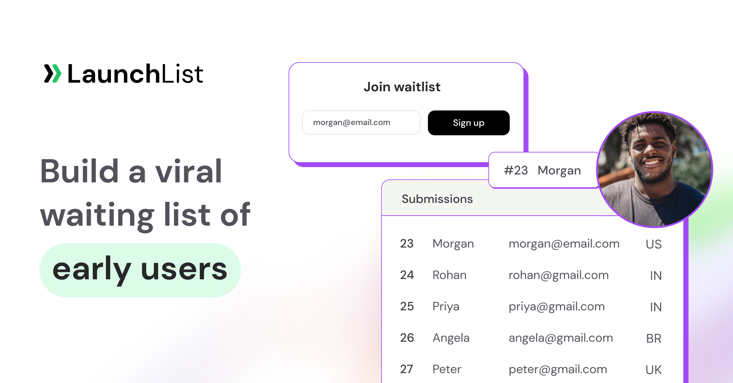
Two options work well for most founders: (1) use LaunchList's hosted waitlist landing page — no website required, or (2) embed LaunchList's widget on a Webflow, Framer, Carrd, Squarespace, WordPress (or any of the 13 natively supported platforms) page. Either option gives you referral management, fraud detection, email validation, and position tracking without building from scratch. See the integration guides.
How do I drive traffic to my waitlist landing page?
The highest-converting pre-launch channels are ProductHunt, Indie Hackers, Twitter/X, Reddit (relevant subreddits), targeted newsletters (like those on Beehiiv), and founder communities. Avoid cold email — it rarely converts on pre-launch offers.
Should I use a countdown timer on my waitlist page?
Countdown timers work when they're truthful and tied to a real event (launch date, cohort start, pricing change). Fake countdowns hurt trust. If you don't have a real deadline, skip it.
How long should a waitlist landing page be?
Shorter is usually better for waitlist pages. A hero section + social proof + 1–2 benefits sections + CTA is enough for most products. Long-form pages (like Beehiiv's) work when you're selling a premium product or ask for payment upfront.
Can I run ads to a waitlist landing page?
Yes, but only after you've validated organic conversion. Paid traffic is expensive on pre-launch because you can't measure LTV yet. Start with Twitter, LinkedIn, or highly targeted Meta ads — and only after the page converts 25%+ on organic.
Build your waitlist landing page today
The patterns in this guide are drawn from real pre-launch campaigns and public case studies — every one of them can be built in under an hour.
If you're ready to ship your own, LaunchList gives you referral management, fraud detection, email validation, a hosted waitlist landing page, and 13 native integrations (Webflow, Squarespace, WordPress, Framer, Carrd, Bubble, Wix, React, HTML, Typedream, Weebly, Instapage, Cargo) to launch today. Start free →
Related reading: